Background
Hart voor Veldhoven is a local organization dedicated to representing the interests of the people in Veldhoven. They serve as a vital voice in the community, advocating for initiatives that enhance the quality of life for all residents. From environmental issues to social services, Hart voor Veldhoven is committed to making Veldhoven a better place to live, work, and play. The organization needed a new image after their rebranding.

Target Group
Hart voor Veldhoven’s target group includes all residents of Veldhoven, with a particular focus on families, seniors, and local business owners. They aim to engage individuals who are passionate about their community and interested in contributing to the development and well-being of Veldhoven. Whether it’s through participating in local initiatives, supporting social programs, or voicing concerns about municipal policies, their audience is broad but united by a shared love for the community.
Challenges
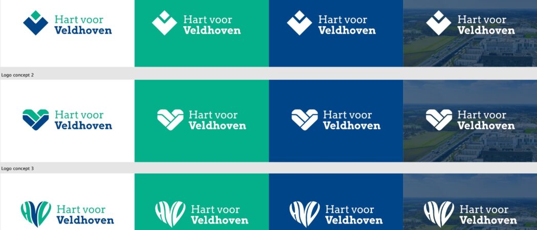
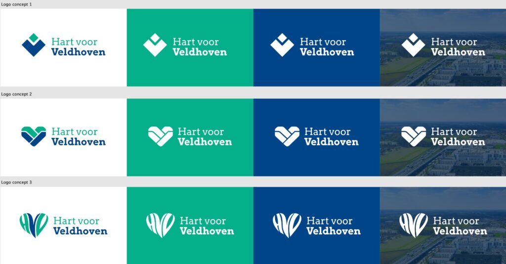
Understanding the importance of this rebranding, I started with extensive research to capture the spirit of Veldhoven and the values that Hart voor Veldhoven stands for. I developed several logo concepts, each reflecting a unique aspect of the community and the organization’s commitment to it.
From bold, contemporary designs to more traditional, emblematic symbols, each logo was crafted with care, considering color theory, typography, and overall brand impact. The goal was to offer Hart voor Veldhoven a range of options that could align with their vision for the future.
The Process
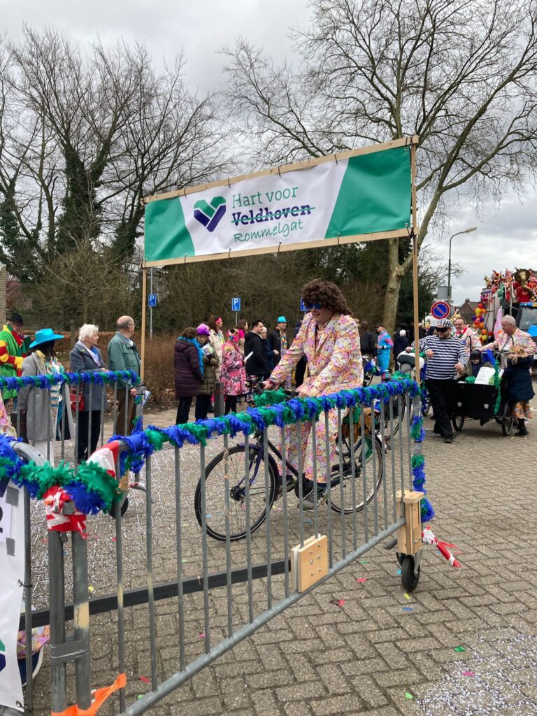
After careful deliberation, Hart voor Veldhoven selected a logo that perfectly encapsulates their brand. This chosen design not only met their aesthetic goals but also captured the warmth, community spirit, and forward-looking vision of the organization.
The new logo has since become a central piece of their brand identity, seen across their communication materials, social media, and community initiatives. It’s been incredibly rewarding to see how this design has helped to strengthen their connection with the people of Veldhoven.